
The tool is insightful, and the site even offers raw data if you really want to play around. The ERS team pulled together 90 different county-level food statistics and put them in one place. You could probably spend a lifetime sifting through the raw data, but a quick glance at the maps can provide insight on the U.S. food environment.
The USDA's goal for the data is to stimulate research in the areas of food choice and diet quality and provide an overview of a community's ability to access healthy food choices.
Looking at a handful of the maps got me thinking a bit more about America's food environment. I understand the dangers in being oversimplistic in evaluating data, but the trends don't add up.
Considering the recent attacks against meat and processed foods in the healthy foods debate, I looked at five graphs that should share similarities if meat and processed foods really are the cause of obesity, diabetes and food-related health issues. I encourage you to visit the atlas and play around too.
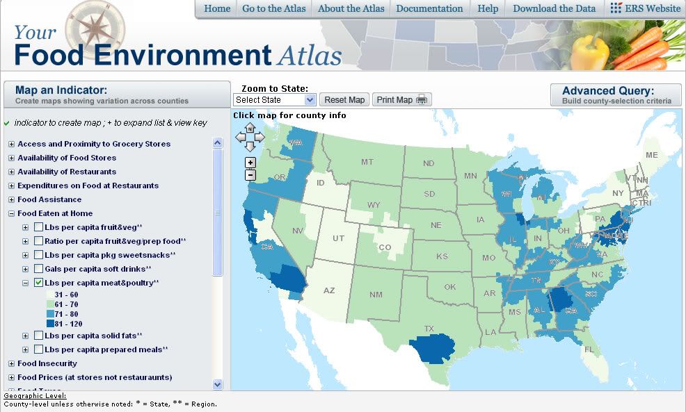
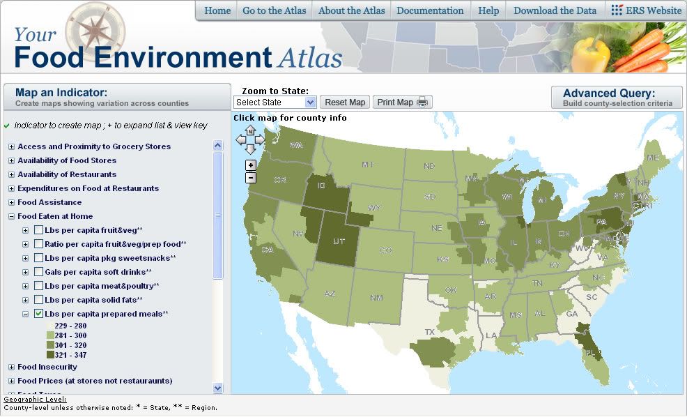
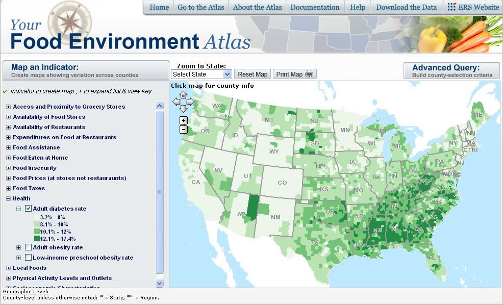
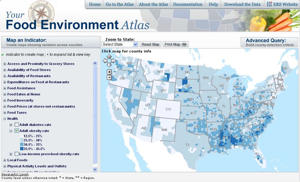
In each of the five graphs below, darker colors indicate higher concentrations of the measured statistic.
Pounds Per Capita Meat and Poultry - Pounds of meat and poultry purchased per resident of the region. Meat and poultry include fresh, frozen, and canned products.
Pounds Per Capita of Solid Fat - Pounds of solid fats purchased per resident of the region. Solid fats include, for example, butter and margarine.

Pounds Per Capita of Prepared Meals - Pounds of prepared meals purchased per resident of the region. Prepared meals include, for example, butter and margarine.
Adult Diabetes Rate - Estimates of age-adjusted percentages of persons age < 20 with diabetes (gestational diabetes excluded).
Adult Obesity Rate - Estimates of age-adjusted percentages of persons age > 20 with obesity, where obesity is BMI is equal to a BMI < 30 kg / m^2.
The graphs between consumption and disease rate don't share a ton of similarities.
It's a stretch to say there's no correlation between food-related disease and the consumption of these three items. I'm a farm boy pursuing a master's degree in agricultural economics, not dietetics. But, the graphs tell me it's an exaggeration to blame the current food system solely for the surge in U.S. food-related illnesses.
My jeans always get a bit tighter in the waist from two bad habits -- eating too much and not exercising enough. Let's keep the big picture in mind. It's human nature to make these issues simpler than they are, but the issues surrounding food-related illnesses are complex.


A friend suggest looking at the Gallons Per Capita of Soft Drinks map under the Food Eaten at Home section of the Food Atlas. This food item does correlate well with the obesity and diabetes maps. I thought you would find that interesting
ReplyDelete